I often tend to prioritize functionality over form, but lately I’ve been wanting to make things I work on look just a little better. When I first started coding 5 years ago, there weren’t as many libraries that did heavy lifting defining breakpoints in a way that was lightweight and easy to work with (I didn’t have as much experience at the time, either).
After not prioritizing it for a while, I decided to add some CSS responsiveness to one of my projects on AWS (somerandomquotes.com).
As a picture (gif) is worth 1000 words, here’s a quick image of the before:

When you drag the screen in, the view collapses and the sidebar is placed front and center. Only when you scroll to the bottom of the sidebar do you finally see the quotes displayed.
At the very least, in a small viewport without responsive handling, as a user, I’d want to see the quotes at the top and actions at the bottom, but there are obviously more ux+ui-friendly ways of handling that. My goal was to implement something intuitive.
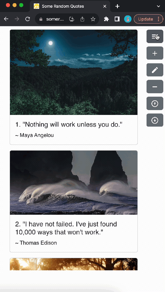
Here’s what I eventually came up with:

Right off the bat, there’s a visible difference between that first gif and the second gif. Namely, the list of actions appears on the right. I did this for 2 reasons, one, I wanted to prioritize displaying the quotes, and 2, I found it easier to see the actions condensed ‘into’ a hamburger icon on the right side.
In order to get to the second gif, I had to:
- refactor the actions (CRUD + sorts), categories, and authors logic into its own component, sidebar.js (should have done this earlier anyways)
- split up the display of CRUD + sort actions from the list of categories and authors
- add logic and css to handle the categories + authors list sliding in and out
- refine the content breakpoints
Sidebar refactor
To me, the most interesting part of this work was getting the sidebar to slide in and out (I up-leveled my css knowledge!).
Here’s the sidebar up close.
To break it down, here’s the gist of the code (reduced for brevity):
Sidebar.js
const Sidebar = { isOpen, toggleSidebar } => {
    const windowSize = useWindowSize(); // a custom calculation hook
    const sidebarClass = isOpen ? "sidebar open" : "sidebar";

    return(
        <>
            {windowSize.width < 600
                ? <div>
                    <Button onClick={toggleSidebar}>
                        <HamburgerMenuIcon />
                    </Button>
                    <div className={sidebarClass} ...>
                        ~~ categories and authors list here ~~
                    </div
                </div>
                : ~~ view for larger screens ~~
            }
        <>
    );
}
Sidebar.css
.sidebar {
    position: absolute;
    left: -80vw;
    height: 100%;
    width: 60vw;
    transition: left 0.3s ease-in-out;
    z-index: 1;
}
.sidebar.open {
    left: 0;
    z-index: 1;
}- if the window gets small enough (< 600px), the sidebar is instantiated
- the view with authors + categories is created to the left, out of view
- position is controlled by css: position: absolute, left: -80vw, and width: 60vw
- when the hamburger menu icon is clicked, the toggleSidebar function Sidebar.js is called. This changes the isOpen prop which controls the categories + authors sheet
- .sidebar to .sidebar.open changes position from left: -80vw to left: 0
- transition left: 0.3 ease-in-out gives a smooth transition in and out
Grid Breakpoints in Material UI
Aside from the sidebar, to add responsive sizing to my front end, I refined the breakpoint sizes provided by Material UI.
Here’s a reduction of an example:
Home.js
import { Col, Row } from 'reactstrap';
...
return (
    <>
        <Row>
            <Col lg={10} md={9} sm={8} xs={11}>
                <Quotes />
            </Col>
            <Col lg={2} md={3} sm={4} xs={1}>
                <Sidebar />
            </Col>
        </Row>
    <>
);
Within a given row, you can control the amount of room each column takes up for a screen size. The total of all columns in that row for a specified size should be no more than 12. Take lg={10} where <Quotes /> is rendered and lg={2} for <Sidebar />, for example. This means that for a large screen size (1200px – 1500px width), the quotes section should take up ~83% of screen real estate while the sidebar should be ~17%. Sizes range from xs to xl, and it’s possible to customize these breakpoints (link).
Some thoughts
One thing I’ve shied away from in past projects is responsive CSS. After this experience though, setting up responsive css, at least at a high level, isn’t that difficult. Going forward, I want to find more balance between making sure something works (well), and the presentation of the thing (organization + UI).
If I were to make additional ui adjustments to this project, I think I’d change the size, color, and effects on the different buttons. I’d also revisit sizing in the my modals.
As always, thanks for reading!
link to repo: https://github.com/timebreaker49/shiny-train


 Wayne Codes